
Damion Smy
Nissan Juke EV will use Leaf platform, due in 2026 - report
9 Hours Ago

Journalist
The design world has gone flat, and that look is now permeating the world of car badging.
Audi has used a flat, two-dimensional version of its four interlocking rings in print and online since 2016. Starting with the rechristened Q8 e-tron, a new two dimensional-look badge will start adorning its cars.
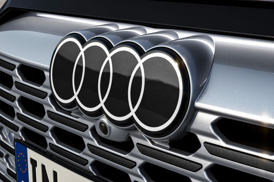
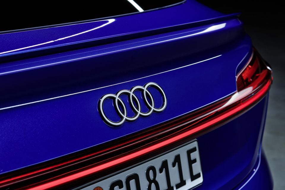
The new badge made a quiet debut when the Audi e-tron was reborn as the Q8 e-tron as part of its mid-life facelift last week.
The standard tailgate badge has a flat, white version of the four-ringed logo bordered by a piece of piano black plastic that’s a few millimetres thick.
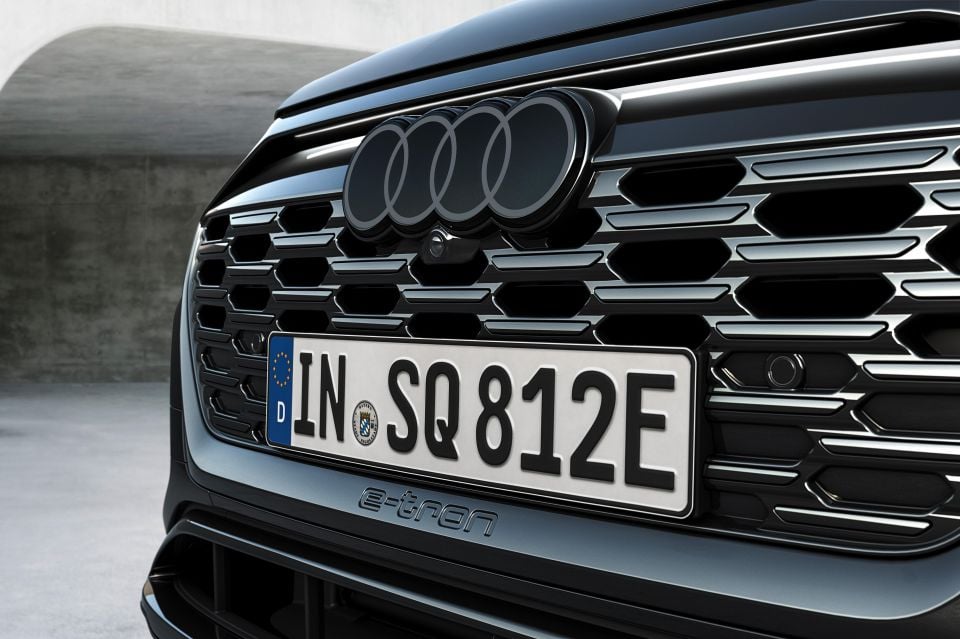
For those keen to dive into Audi’s option list or buying sportier variants, there’s also an all-black version of the new badge. The all-black logo effectively replaces the dark grey logo used up until now.
Up front there’s a slightly different badge design, where the centre section of the interlocking rings is filled in with glossy black plastic, presumably to help hide radar and other vehicle sensing equipment. On sports models, the four rings are dark grey.
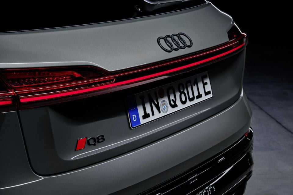
André Georgi, head of Audi’s interface department and the leader of the logo redesign project, says, “The new two-dimensional look gives our rings a significantly more modern and even more graphic makeover, although their geometry is almost identical to the former ones”.
Georgi claims that “by optically brightening the logo, the white lends the rings a flat, premium-quality look, which still appears three-dimensional in detail”.
As well as unifying the brand’s logo across all spaces, the new badge is said to be part of the company’s minimalist design ethos. According to Marc Lichte, Audi’s design chief, “Good design is less design”.
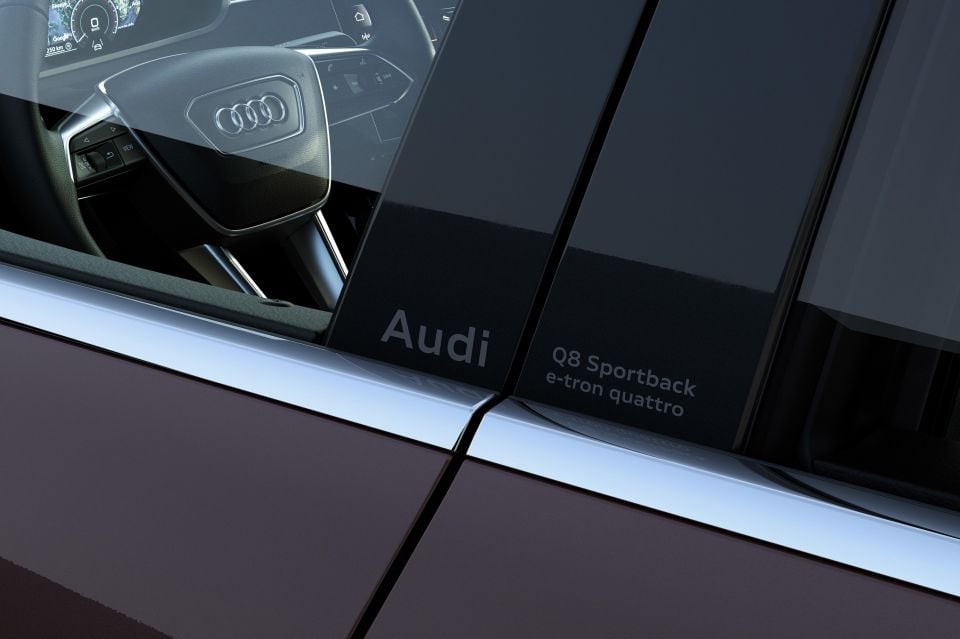
Starting with the Q8 e-tron, variant information will be etched onto the car’s B-pillars. From what we can tell, this means the Audi logo and model name will be the only identifying marks on the rear of future vehicles.
In addition to this, Audi Type, the brand’s font, will also be used exclusively in and around the company’s cars.
Audi is just the latest automotive brand to refresh its logo in recent times.
While Kia ditched its long-standing oval badge for a dramatically different Cyrillic-style word mark at the beginning of 2021, most other marques have gone for more subtle refreshes, such as the latest Volkswagen and Nissan logos.
Where expert car reviews meet expert car buying – CarExpert gives you trusted advice, personalised service and real savings on your next new car.
Derek Fung would love to tell you about his multiple degrees, but he's too busy writing up some news right now. In his spare time Derek loves chasing automotive rabbits down the hole. Based in New York, New York, Derek loves to travel and is very much a window not an aisle person.


Damion Smy
9 Hours Ago

Damion Smy
12 Hours Ago

Damion Smy
16 Hours Ago

Damion Smy
18 Hours Ago

Damion Smy
18 Hours Ago


Damion Smy
18 Hours Ago