

Damion Smy
Suzuki Fronx recalled after seatbelt failure sparks ‘urgent investigation’
5 Hours Ago
Featuring marques that major on utility, luxury and performance almost in equal variety, Britain remains home to some of the most famous car brands in the world. Here are four of them.

Contributor

Contributor
British automotive brands run the gamut from ultra high-end to cars for the everyman, and from profitable to perennially on the brink of bankruptcy. Although positioned differently from each other, these four British brands all have something in common: they’re all household names, and all of their logos feature wings.
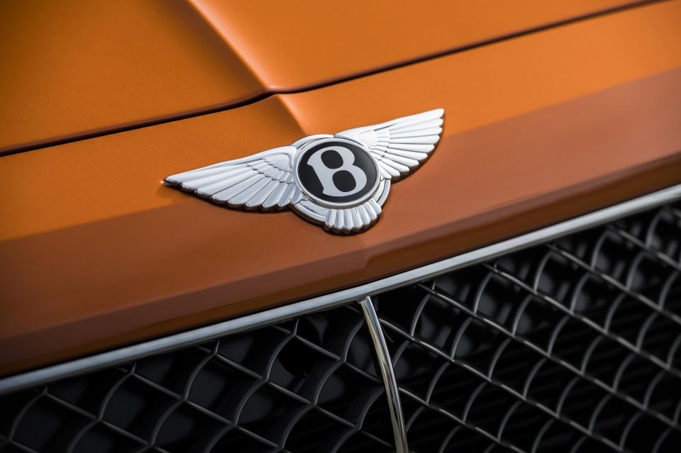
Bentley is often perceived as the slightly less famous, but more sporting alternative to Rolls-Royce, and although the two badges shared common histories and models at certain points in the past, the firm in its current iteration is substantially different from its Rolls-Royce compatriot.
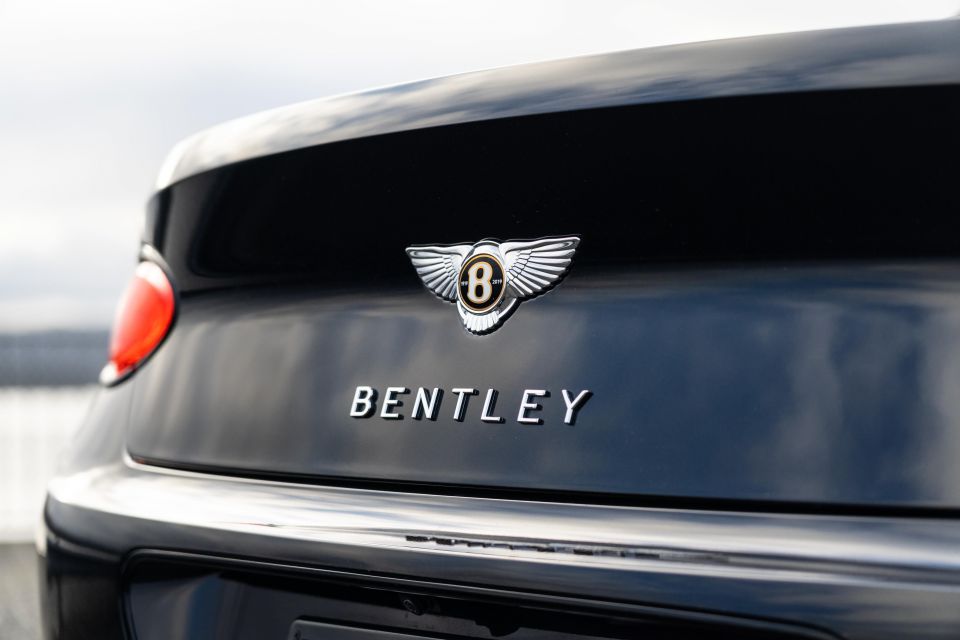
Currently owned by the Volkswagen Group, Bentley was established by Walter Owen Bentley (commonly known as W.O. Bentley) in 1919. Legend has it that W.O. Bentley was fond of mechanics and how moving things worked from a very young age; at just nine years old, he managed to buy a bicycle and successfully dismantled it on a journey to understand how it worked.
Later, he applied his talents to modifying motorcycles for racing use, and developed an aluminium alloy to make lighter pistons for internal combustion engines that would later be used in the manufacture of aircraft engines for the British war effort during World War 1 – all before starting his car company!
From the get-go, Bentley’s vehicles were designed to be luxurious and performant in equal measure. The firm’s racing pedigree would be cemented through five wins at Le Mans from 1924 to 1930, and its ability to produce genuine luxury cars confirmed through models such as the Bentley 8-Litre, which W.O. intended to be silent even at 100mph.
The 1930s saw the onset of the Great Depression, however, and this meant the firm’s wealthy clientele could hardly afford to buy expensive cars of the type sold by Bentley. Sales consequently fell off a cliff, and rival Rolls-Royce stepped in to ostensibly save the company, but also to remove any threat that the 8-Litre posed to its flagship Phantom II. The two brands would continue to be joined at the hip until the late 1990s.
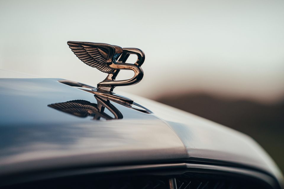
During all this time, however, the Bentley emblem has remained relatively consistent. The emblem is commonly known as ‘the flying B’, and correspondingly, it consists of two wide wings spread outwards from a black disc containing a bold, white letter B inside. The intention behind this design was to emphasise the view that driving a Bentley at speed was the closest that one could come to flying.
Bentley models that feature a bonnet ornament emphasise this further through a slightly slanted B with wings behind it, almost creating the impression that the car is ready to leap into the air.
The winged B emblem design also drew inspiration from the winged sun symbol, commonly seen in ancient civilisations such as Egypt, Sumeria and Assyria, and associated with ideals of divinity, power and royalty.
Aston Martin and film go hand in hand like wine and cheese, and perhaps no other car brand’s image has come to be defined by a series of movies like Aston Martin. The preferred car of choice for James Bond, models such as the iconic DB5 have come to define suave elegance, with the firm’s special operations department, Q Division, even being named after the famous Q Branch in the movies.
Despite its classy, upmarket image, Aston Martin has been in financial trouble perhaps more than any other brand here, and the firm’s long-standing ‘DB’ nameplate is a reference to investor David Brown, who bought the firm for 20,000 pounds in 1947 and successfully applied his previous experience as a tractor entrepreneur to transform the brand’s fortunes in the 1950s.
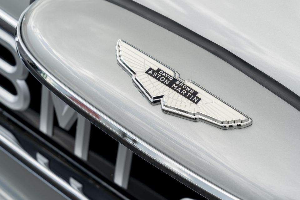
As hinted at by the name ‘Aston Martin’, the firm’s history long precedes David Brown, with ‘Martin’ referring to founder Lionel Martin, who started the company in 1913, and Aston deriving from the fact that an early car made by the firm attempted and won the Aston Clinton Hill Climb race.
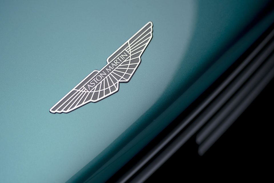
The company’s first logo, designed in 1921, featured the letters ‘A’ and ‘M’ overlapping each other in a stylised fashion within a circle. This was altered in 1927 with a winged design, that by 1932, drew an undeniable influence from the Bentley wings. Apart from minor font changes, and the addition and removal of the David Brown moniker, the Aston Martin wings have seen little change.
The original Mini, developed under the British Motor Corporation and sold under the Austin and Morris nameplates, was known not only for its cute looks but also its pioneering space efficiency. A little pop culture stardust came from its presence in films like The Italian Job and the TV show Mr. Bean.
The classic Morris Mini emblem (the badge-engineered Austin Seven had a different logo comprising a coat of arms with the Austin wordmark below) is the spiritual predecessor for the emblem design of today’s BMW owned Mini brand.
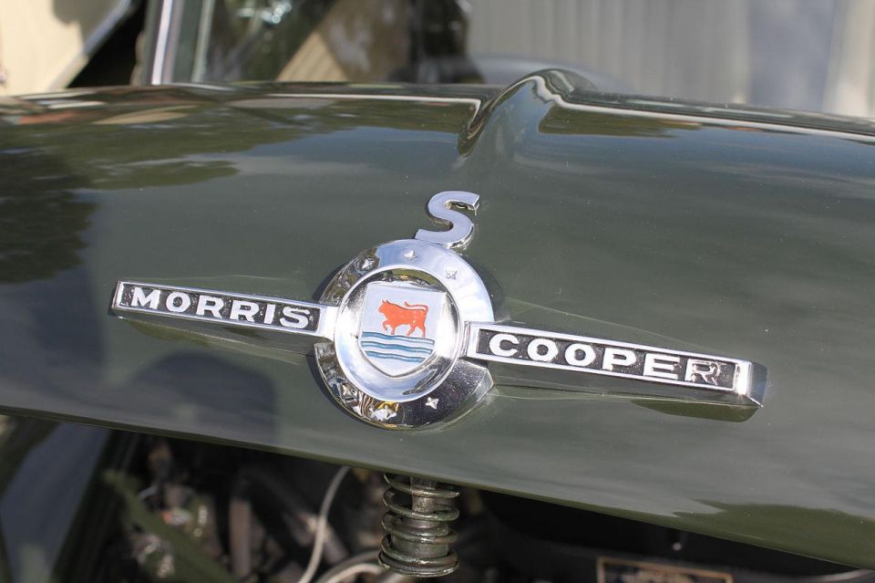
This consisted of the Morris emblem, which depicted its Oxford-based heritage by showing an Ox fording the river Isis, encapsulated within a circle with two outward arrows on either side that could also be construed as wings.
John Cooper’s sportier edition of the Mini, launched in 1962, evolved this design with its own logo, replacing the Morris emblem with italicised ‘Mini Cooper’ lettering within a laurel wreath, and changing the arrows to deliberately be wings.
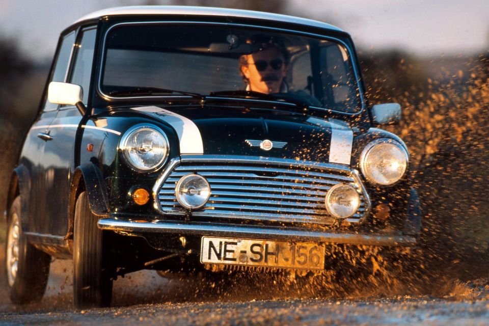
With Morris and Austin branding dropped in 1969, the Mini became its own sub-brand within the wider British Leyland Group, and this necessitated another evolution, with a simple Mini wordmark replacing the laurel wreath of the Cooper models and being applied to all Mini variants. In conjunction with another, more elongated hexagonal design, this persisted until the late 1990s when the successor Rover Group was bought out by BMW.
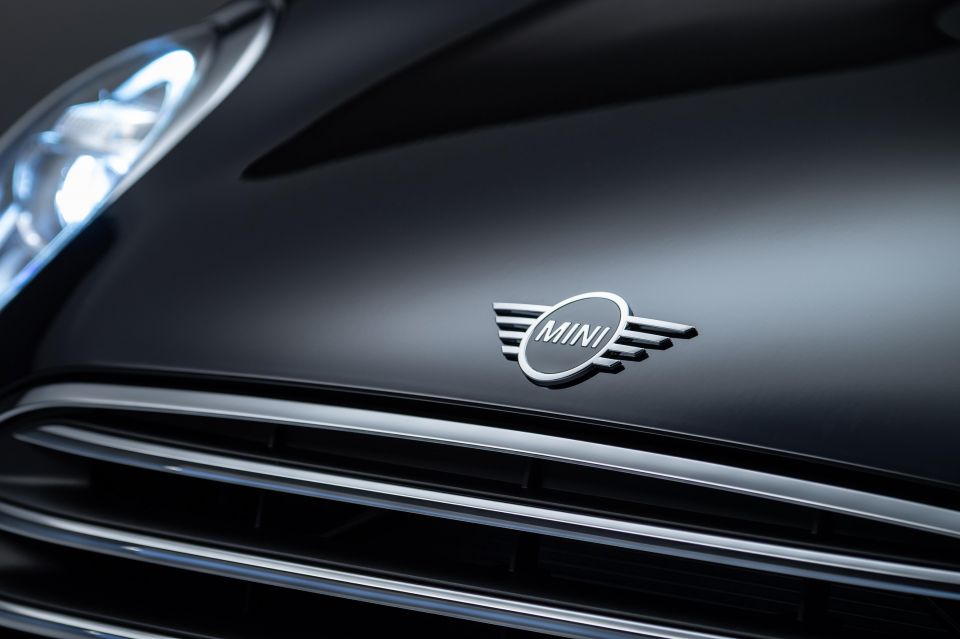
BMW’s ownership and the launch of an all-new, modern Mini meant another design change in 2001, with the winged design being made three-dimensional before being replaced with a monochrome, flat look in 2018.
Rather than speed and grace like with Aston Martin and Bentley, the wings on the Mini logo are ostensibly geared more to represent the adventurous, youthful and free-spirited characteristics of the brand.
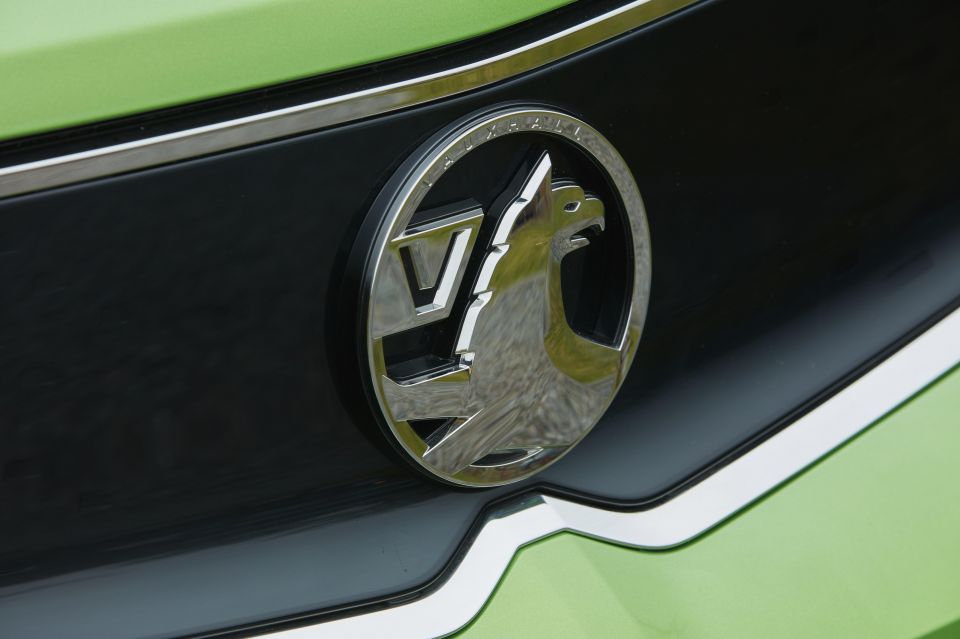
Vauxhall is perhaps best thought of as the British Holden (especially during the time it was under General Motors ownership) and perhaps surprisingly is the oldest brand here. The company is able to trace its roots all the way back to 1857, when Alexander Wilson founded the firm in Vauxhall, London as a manufacturer of pumps and marine engines. The company began automobile production in 1903, before being acquired by General Motors for US$2.5 million in 1925.
Vauxhall is known as the griffin brand, with the griffin being a mythological creature that combines an eagle’s head and wings with the body of a lion. The use of this creature as the Vauxhall emblem dovetails with the history of the London district of Vauxhall itself.
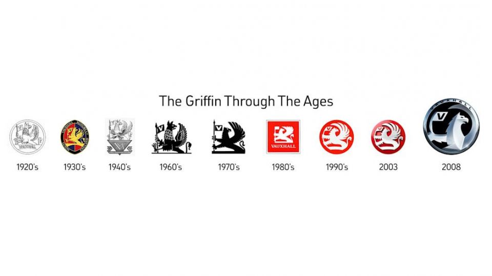
According to legend, Sir Falkes de Breauté was an English soldier who lived in the 13th century, and his house in London consequently bore the apt name of Falkes’ Hall. Over time, this evolved into Foxhall and then Vauxhall afterwards, with the name of the house also giving itself to that of its entire district in London. The family coat of arms, featuring a griffin, remained constant, however, and it was this feature that Vauxhall (the car company) decided to use as its emblem.
Although the shape of the emblem has changed from rectangular to circle, the image of the griffin holding the ‘V’ flag has remained constant, with subtle updates and modernisations over time. In recent years, for example, much of the griffin’s body has been cropped out.


Damion Smy
5 Hours Ago

Damion Smy
6 Hours Ago

Damion Smy
7 Hours Ago

Damion Smy
10 Hours Ago

CarExpert.com.au
11 Hours Ago


Ben Zachariah
13 Hours Ago