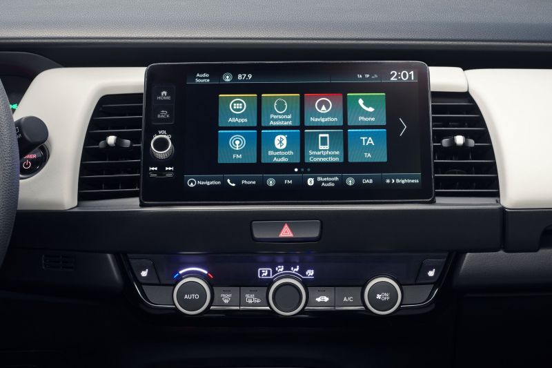
Last month Takeki Tanaka, project leader for the fourth-generation Honda Jazz, told Autocar: “We changed [the heater and air conditioning controls] from touchscreen to dial operation, as we received customer feedback that it was difficult to operate intuitively.
“You had to look at the screen to change the heater seating, therefore, we changed it so one can operate it without looking, giving more confidence while driving.”
Woohoo! Let’s raise one for common sense. Oh, what’s that? The new Jazz isn’t coming to Australia because the margins are thin and everyone wants a crossover instead. Dammit.
Back to touchscreens, though.
Touchscreens are fantastic. No longer do we need to bash an infeasibly large number of tiny keys in the area of a 50 cent coin just to send a text, which can only be a good thing.
And while large slabs of button-less glass are perfect for phones and tablets, they should never replace the most commonly used physical buttons and switches in our cars.
Why? For the simple reason that we’re piloting a one- to two-tonne device at, potentially, life terminating speeds.
In a car, a touchscreen is perfect for displaying satellite navigation instructions and hiding away the myriad small functions I rarely ever change.
Do I need a host of buttons on the dash just so I can change the ambient lighting, pair my iSlabOfGlass S40e Ultra Max, restrict the courtesy lights to just 12.5 seconds of operation, or activate the signed, cougar-themed puddle lights?
Probably not. Bury them all in the touchscreen system somewhere, and let me dig through them when I’m safely parked.
The temptation then becomes, though, to explore which other functions can be shifted from the physical realm to on-screen?
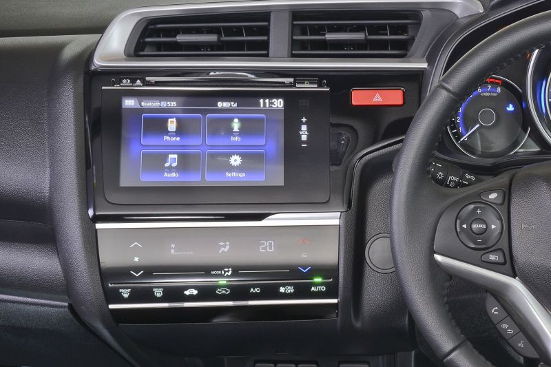
Honda went too far with the original design for the third-generation Jazz.
The infotainment system had no physical buttons except for those on the steering wheel. To make matters more infuriating, the company replaced the volume/power dial with an infuriating capacitive slider.
A set of capacitive buttons was also used for the climate control system, again fusing the worst of touchscreen operation – the lack of blind feel and the constant need to look at your fingers – with none of the flexibility of a real touchscreen.
Even the most poorly designed layout of traditional buttons, dials, and sliders was better.
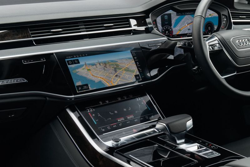
Automakers have come up with better touchscreen solutions. For instance, the dedicated climate control screen on new high-end Audis features with haptic feedback, letting you feel your way across the screen until you come to the right spot.
It’s still not better than real buttons, but it’s better than a flat and feelingless void. Given the sheer size of the screen and its virtual buttons, you could still argue Audi would have been better off with a traditional thin strip of climate controls, with the less commonly used features relegated to a larger main touchscreen.
Hopefully Honda isn’t the only carmaker having second thoughts about committing too much to the touchscreen.
What do you think? Would you like to see more functionality on touchscreens or less? And if you have a car that’s gone aggressively down the touchscreen route, fill us in your experiences (good and bad) in the comments.


